


The World Wide Web's Paintbrush
If you know anything about web development and HTML, then you know that HTML by itself is not pleasant visually.
Not only is it just ugly and hard to look at, you can't really customize the page layout, structure, or theme with just HTML.
This is where CSS comes into play.
Cascading Style Sheets History
The first version of CSS was released in 1996, Cascading Style Sheets, and allowed users to select font style and sizing as well as change the color of basic elements like the background.
CSS 2 (1998) has capabilities that allows the user to design page layouts.
CSS 3 (1999) allows the user to create presentations from documents and also select from a wider range of fonts including those from Google and Typecast. CSS 3 allows the user to incorporate rounded borders and use multiple columns. CSS3 is considered to be easier to use (when compared to CSS2).
Since then, there hasn't really been a CSS 4 - rather many updates to CSS 3.
The Goal
By the end of this article, you will know the basics of styling with CSS.
You won't be a CSS master artist by any means haha, but you will know what the Cascading Style Sheets language is.
And more importantly, you will know how to write it.
The Set Up
If you haven't already read the previous article "HTML 5: An Introduction" where we go over the basic set up of viewing webpages for development - I highly recommend you do so - you can follow along with that the setup we use in that article there =>
techtutz.hashnode.dev/html-5-an-introduction
We start by creating a new folder and then opening it with our editor.
I am using VS Code although any editor will do.
Then we can make a HTML file and a CSS file.
Ending the file name in .css is how we tell the machine that the document we are working with is a style sheet and isn't just a regular text document.
myNewFolder / myFirstWebPage.html
myNewFolder / myFirstStyles.css
Writing CSS
For the sake of the simplicity, I am going to provide the HTML we will be using in this article.
I do this to focus solely on the styling of the page.
Although if you want to craft up your own HTML, feel free.
To start, we just need something simple - some text will work just fine.
HTML
<!DOCTYPE html>
<html>
  <head>
    <title>My Webpage</title>
  </head>
  <body>
     <h1>Example Title Header</h1>
     <p>Example Paragraph Tag<p>
  </body>
</html>
Now that have some we have some basic HTML, we need to tell our page that we have a CSS document to use for styles, see below how we use the < link /> tag to do so.
HTML
<!DOCTYPE html>
<html>
  <head>
    <title>My Webpage</title>
    <link rel="stylesheet" type="text/css" href="./myFirstStyles.css"/>
  </head>
  <body>
     <h1>Example Title Header</h1>
     <p>Example Paragraph Tag<p>
  </body>
</html>
We use attributes such as rel and type to give more info on what we are providing, while the href attribute is where we give the file path to the CSS file.
rel is a required attribute that specifies the relationship between the two documents.
type specifies the type of the media you are linking.
Just like the < a > tag's href, we are specifying where the document is.
In our case it's in the same folder so the file path is nice and short.
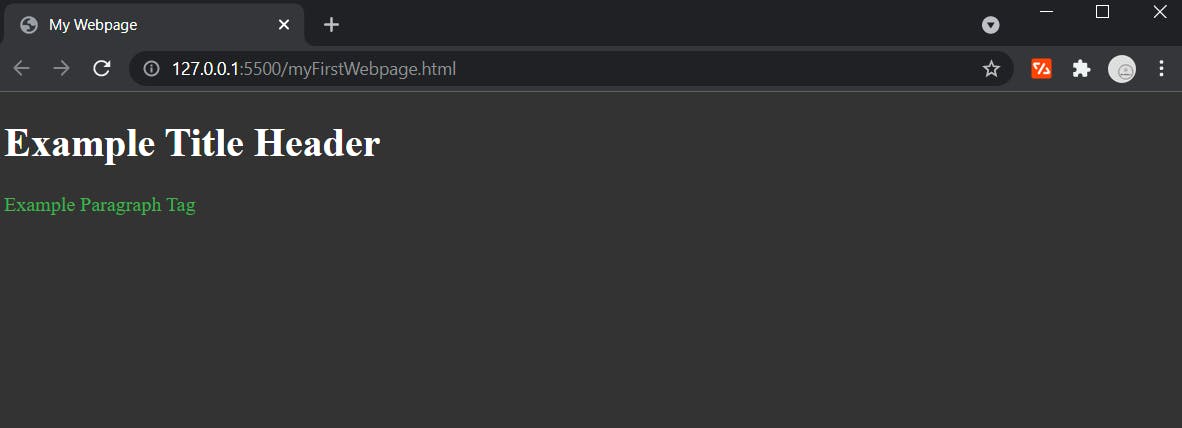
Before we add any styles, let's take a look at how the HTML looks by itself.
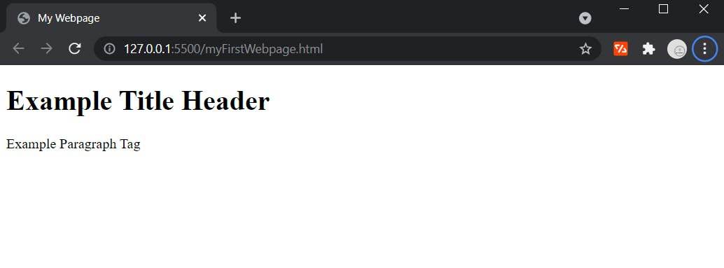
As mentioned previously, plain HTML is functional. . . but ugly as can be
( sorry HTML, just being honest ).
Time for Some CSS Magic
You can change properties about an element like the color, size, position, to pretty much everything else you could think of.
Let's start with some basics here and maybe later in another article we can cover more advanced CSS topics.
Colors
One of easiest thing we can change about an element is the color.
By default the background color for the entire HTML document is white
( everything in between the < html >< html /> tags ).
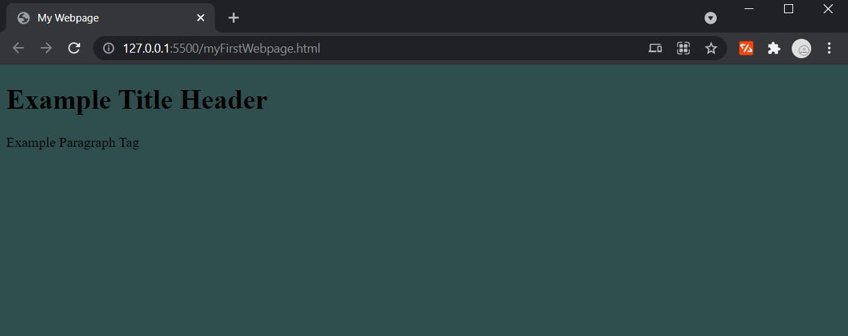
Here's how we can change it =>
CSS
html {
    background-color: darkslategrey;
}
And when we refresh the browser we get this.
You will notice that you first specify what element you want to apply styles to, then in brackets you provide key : value pairs of properties to change.
Color Keywords
Here we are setting the color to a color keyword => darkslategrey.
There are many other color keywords you can use for styling.
Although it is less common these days, it is still a viable option for styling.
More often than not, you will set colors with one of two numbers values -
hexadecimal or RGB.
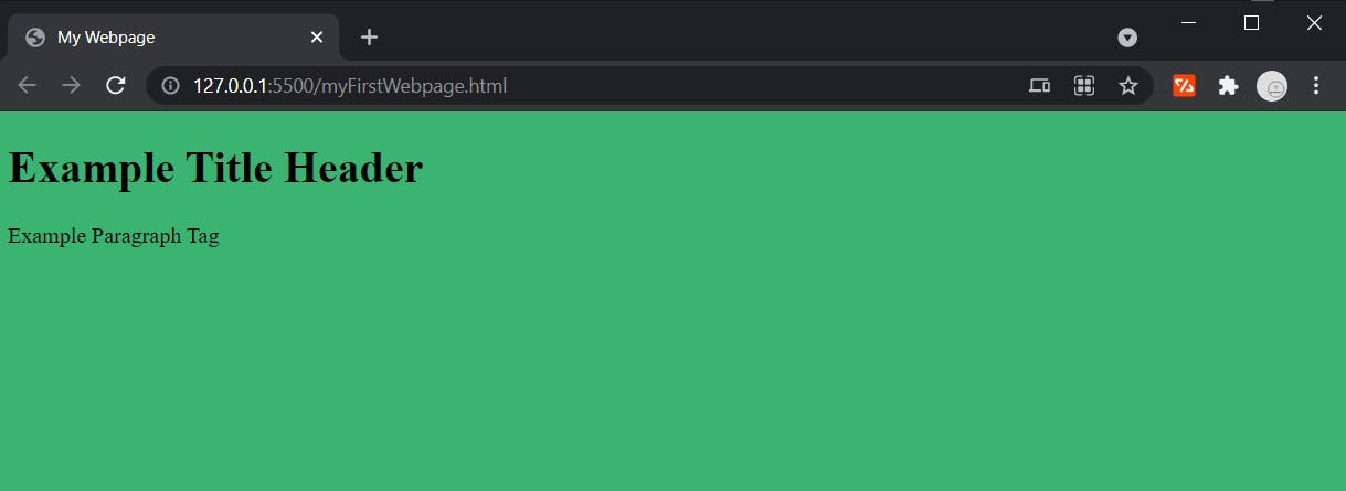
RGB
RGB is noted as rgb(R, G, B).
RGB represents red, green, and blue light sources as number values.
Below is an example of how to style an element with a RGB color value.
CSS
html {
    background-color: rgb(60, 179, 113);
}
Browser output
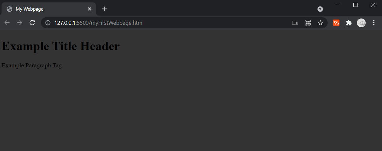
Hexadecimal
Hexadecimal is noted as #RRGGBB.
Hexadecimal integers specify the components of the color in the order of red, green, and then blue number values.
CSS
html {
    background-color: #333333;
}
And the output
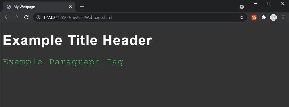
Now we can add some color to our font.
CSS
html {
    background-color: #333;
}

h1 {
    color: #fff;
}

p {
    color: #4caf50;
}
See how our text is much more visible now.
Notice
If a hexadecimal color is a pair of triplet values, you can use just one the triplet pairs to get the same color output.
For example - solid white can be written one of two ways in hexadecimal format.
solid white => # f f f f f f
solid white => # f f f
Font
Another area of essential styles we can't miss is font.
Below is an example of changing the font-family, size, and letter spacing.
CSS
h1 {
    font-family: sans-serif;
    font-size: 45px;
    letter-spacing: 2px;
    color: #ffffff;
}

p {
    font-family: 'Courier New';
    font-size: 30px;
    letter-spacing: 1px;
    color: #4caf50;
}
Output below
Notice
By default, the available font-families you can choose from are called Web Safe Fonts - such as the ones I used sans-serif and Courier New.
If a font-family name is more than one word, you will need to use quotes around it - such as Courier New.
You can also import external font libraries to get access to other fonts.
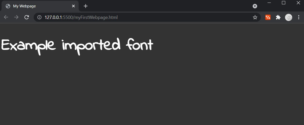
Here is an example of an imported font from Google.
CSS
@import url('https://fonts.googleapis.com/css2?family=Indie+Flower&display=swap');

html {
    background-color: #333;
}

h1 {
    font-family: 'Indie Flower';
    font-size: 50px;
    color: #fff;
}
Browser output
Notice
Font sizes can specified in one of three units -
px => Pixels
em => Element
rem => Root Element
Pixels are one of the most common and easy to understand units, simply just a pixel value here.
Element refers to the relative defined font size of the element in which the font is located.
Root Element refers to the relative defined font-size of the root element, or the default font size for the whole document (16px in most cases).
Size
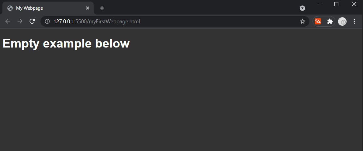
One of the most useful things to adjust about an element is it's size.
Below is an empty < div > element without any CSS.
HTML
<!DOCTYPE html>
<html>
  <head>
    <title>My Webpage</title>
    <link rel="stylesheet" type="text/css" href="./myFirstStyles.css"/>
  </head>
  <body>
    <h1>Empty example below</h1>
    <div></div>
  </body>
</html>
Output
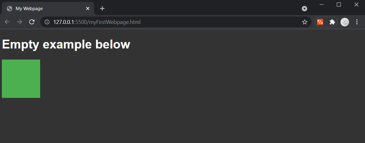
Now let's give the div a height and a width as well as a background-color so that when we change the size we can easily see what's going on.
CSS
div {
    height: 100px;
    width: 100px;
    background-color: #4caf50;
}
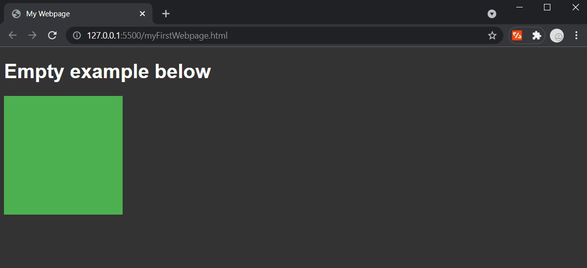
Just like with fonts, you can use px, em, or rem units.
CSS
div {
    height: 10rem;
    width: 10rem;
    background-color: #4caf50;
}
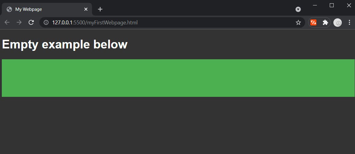
With container elements like div you can also use % as a value.
This means set as a % of the parent element (parent element refers to the element that the div is contained in).
In our case, the parent element is the body element - but just remember it means whatever element yours is nested in.
Below is an example of setting the div width to 100% of it's parent element.
CSS
div {
    height: 100px;
    width: 100%;
    background-color: #4caf50;
}
 .
.
Much like %, you can also use two other units -
vw => view port width
vh => view port height
View port refers to the scale of screen being utilized by the user, and these units are referring to a % of the view port width or height.
CSS
div {
    height: 100vh;
    width: 100vw;
    background-color: #4caf50;
}
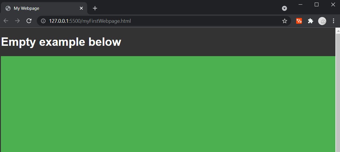
You can see the overflow created (scrollbar now visible) because the entire page is now 100% of the view port plus more, so it overflows.
Position and Alignment
A huge aspect of styling webpages is moving elements around where you need them.
This can be pretty tricky if you aren't aware of how positioning and alignment works with CSS.
I won't be covering every aspect and detail of each kind of styling here because each topic could be it's own article of information.
What I will do is provide enough context for you for you to use this information in your own projects.
Transform
You can move elements around the page, and one of the easiest way to do that is with transform.
You can do many other cool things with transform, but today I am just covering translations.
Below is what we have before we transform the div.
HTML
<!DOCTYPE html>
<html>
    <head>
        <title>My Webpage</title>
        <link rel="stylesheet" type="text/css" href="./myFirstStyles.css" />
    </head>
    <body>
        <h1>Translation Example</h1>
        <div></div>
    </body>
</html>
CSS
html {
background-color: #333;
}
h1 {
color: #fff;
}
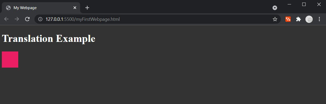
div {
height: 50px;
width: 50px;
background-color: #e91e63;
}
Browser output
Now we can add a transform.
div {
    height: 50px;
    width: 50px;
    background-color: #e91e63;
    transform: translateX(100px);
}
Browser output
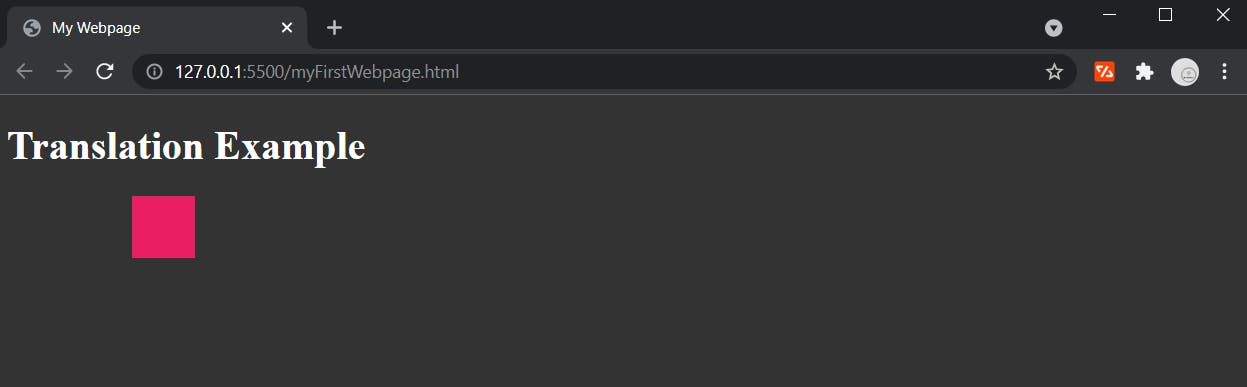
You can move elements along all 3 of their axis -
x => translateX()
y => translateY()
z => translateZ()
The X axis is directions left and right horizontally across the page.
The Y axis is directions up and down vertically across the page.
The Z axis is referring to the document's elements as layers, like a stack of pancakes which value represents where the element is in the stack.
Notice
You can specify positive or negative values here, the negative sign changes which direction on the axis the element is moving.
Layout
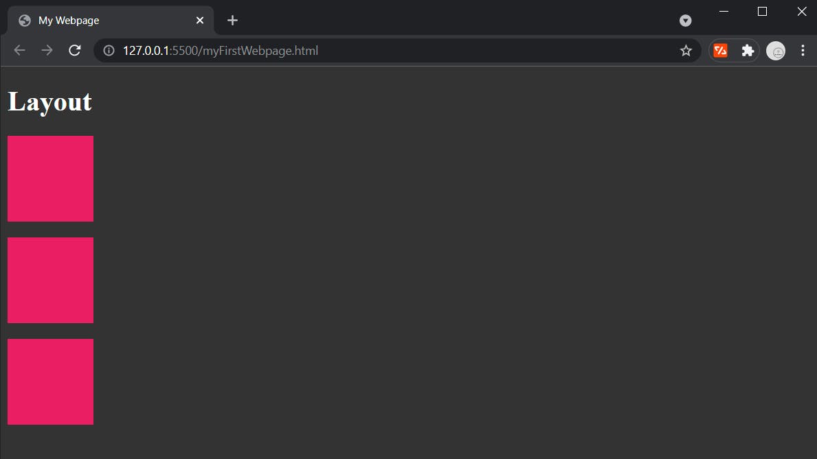
By default, an HTML document will be displayed as a column going down the page.
Each element will take up the entire "row" for that section.
That's why when you have more than one element, by default they are stacked going down the page and not side by side horizontally.
Below is an example of this.
HTML
<!DOCTYPE html>
<html>
    <head>
        <title>My Webpage</title>
        <link rel="stylesheet" type="text/css" href="./myFirstStyles.css" />
    </head>
    <body>
        <h1>Layout</h1>
        <div></div>
        <br />
        <div></div>
        <br />
        <div></div>
    </body>
</html>
CSS
html {
    background-color: #333;
}

h1 {
    color: #fff;
}

div {
    height: 100px;
    width: 100px;
    background-color: #e91e63;
}
Browser output
To change this, we can set the display property.
There are many options for the display property but I will cover just a few today =>
Block
body {
    display: block;
}
Block is the default display property value.
It tells the browser that the elements block that section (or row) of the document.
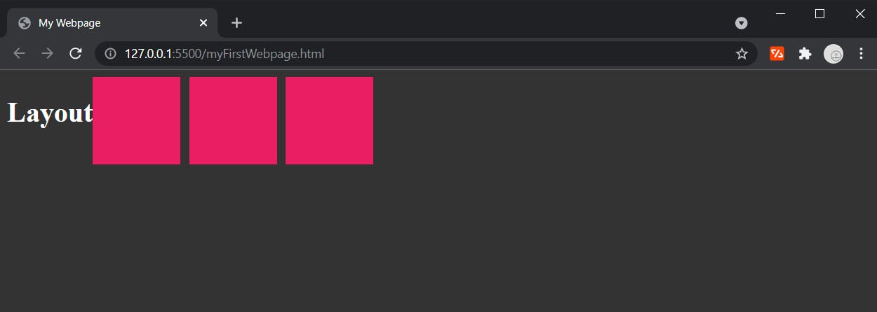
Flexbox
body {
    display: flex;
}
Flexbox allows you to choose which way things are aligned in an element.
By default setting display: flex will turn the element's content alignment horizontal (adding some spacing so it's easier to see here).
CSS
div {
    height: 100px;
    width: 100px;
    background-color: #e91e63;
    margin-right: 10px;
}
Browser output
Grid
There are two ways to structure a grid layout.
You can use grid template columns and grid template rows,
or you can use grid template areas.
Essentially they can produce the same output styles, just different ways of doing so.
I am just going to cover grid template columns and grid template rows today.
HTML
<!DOCTYPE html>
<html>
    <head>
        <title>My Webpage</title>
        <link rel="stylesheet" type="text/css" href="./myFirstStyles.css" />
    </head>
    <body>
        <div></div>
        <div></div>
        <div></div>
        <div></div>
        <div></div>
        <div></div>
    </body>
</html>
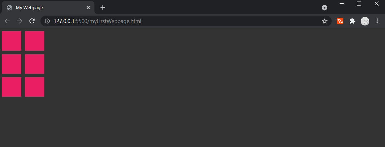
Notice
I added more div's and made them smaller so the grid layout makes more sense visually and is easier to see.
CSS
html {
    background-color: #333;
}

body {
    display: grid;
    grid-template-columns: 50px 50px;
    grid-template-rows: 50px 50px;
    grid-gap: 10px;
}

div {
    height: 50px;
    width: 50px;
    background-color: #e91e63;
}
Grid template columns specifies the total number of columns as well as the size of each column.
Grid template rows specifies the total number of rows as well as the size of each row.
Grid gap is the spacing between columns and rows, by default this is zero.
Browser output
Notice
You can also set these values as auto if you want the space to be filled automatically without a set value.
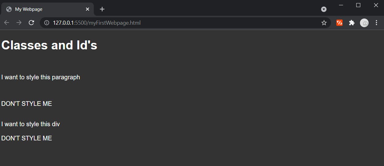
Classes and Id's
Now if you haven't asked yourself the question "What if I want to style one particular element and not all the elements of that type?" then below is a perfect example of this scenario.
Let's say we have the below. HTML
<!DOCTYPE html>
<html>
    <head>
        <title>My Webpage</title>
        <link rel="stylesheet" type="text/css" href="./myFirstStyles.css" />
    </head>
    <body>
        <h1>Classes and Id's</h1>
        <br />
        <p>I want to style this paragraph</p>
        <br />
        <p>DON'T STYLE ME</p>
        <br />
        <div>I want to style this div</div>
        <br />
        <div>DON'T STYLE ME</div>
    </body>
</html>
CSS
html {
    background-color: #333;
    font-family: sans-serif;
    color: #fff;
}
Browser output
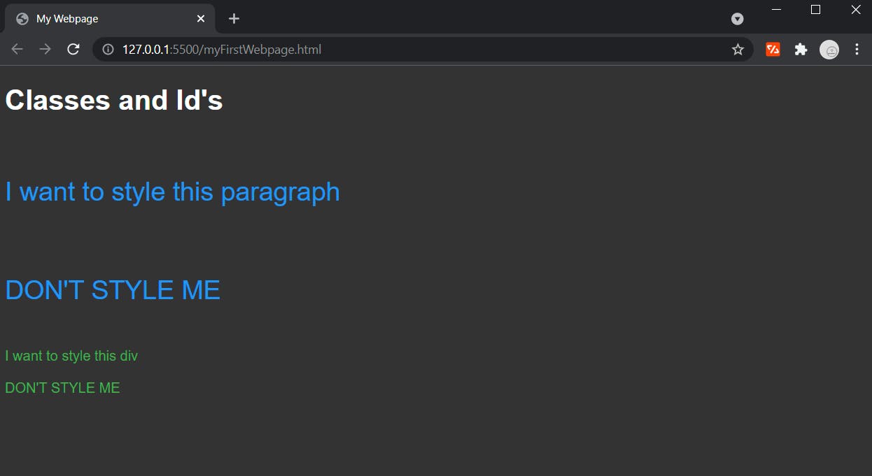
Now when we add styles the paragraph and div tags, it applies to all of those elements.
CSS
html {
    background-color: #333;
    font-family: sans-serif;
    color: #fff;
}

p {
    font-size: 30px;
    color: #2196f3;
}

div {
    color: #4caf50;
}
Browser output
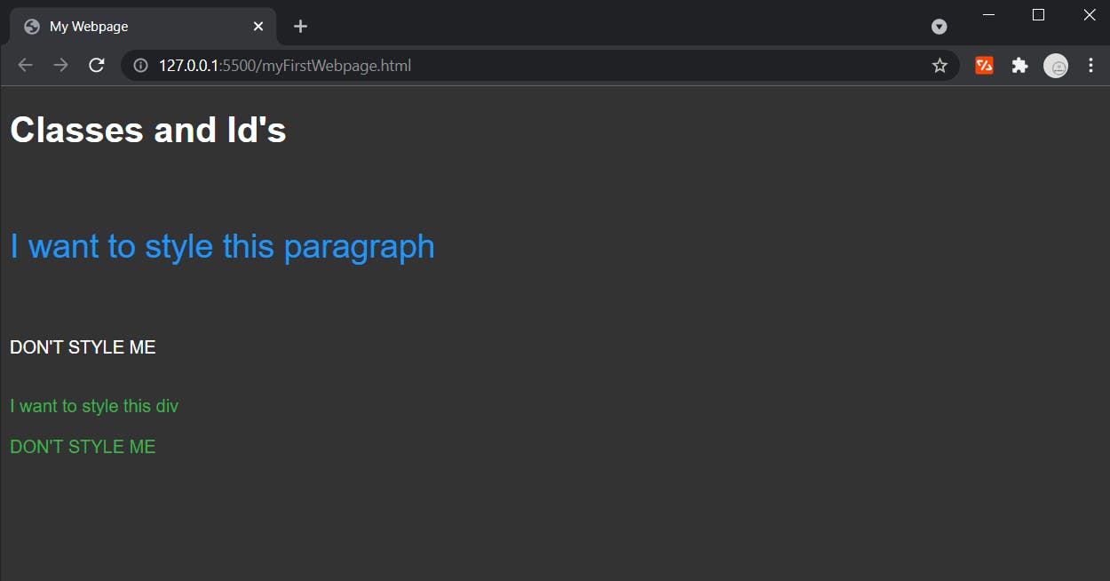
So this where id's come into play.
Id's
We can give elements unique id's, and then target those id's for styling - so that way only the element with that id gets styled.
Below is an example of adding an id to a paragraph tag and then applying styles to it.
HTML
    <body>
        <h1>Classes and Id's</h1>
        <br />
        <p id='styled-paragraph'>I want to style this paragraph</p>
        <br />
        <p>DON'T STYLE ME</p>
        <br />
        <div>I want to style this div</div>
        <br />
        <div>DON'T STYLE ME</div>
    </body>
When applying styles to an id, make sure you include a hash symbol first - #.
This tells the document we are specifying an id.
CSS
html {
    background-color: #333;
    font-family: sans-serif;
    color: #fff;
}

#styled-paragraph {
    font-size: 30px;
    color: #2196f3;
}

div {
    color: #4caf50;
}
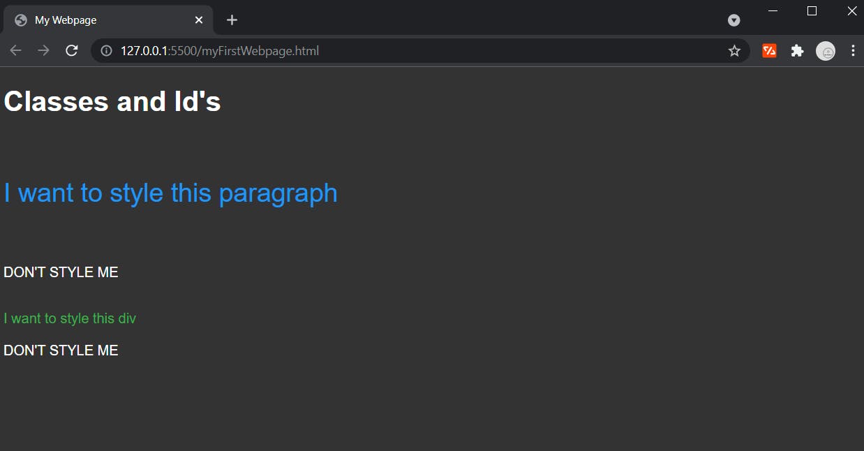
Browser output
Now we can add an id to the div we want to style.
HTML
    <body>
        <h1>Classes and Id's</h1>
        <br />
        <p id='styled-paragraph'>I want to style this paragraph</p>
        <br />
        <p>DON'T STYLE ME</p>
        <br />
        <div id='styled-div'>I want to style this div</div>
        <br />
        <div>DON'T STYLE ME</div>
    </body>
Here and change the CSS to target just that id.
CSS
#styled-paragraph {
    font-size: 30px;
    color: #2196f3;
}

#styled-div {
    color: #4caf50;
}
Browser output
Classes
Just like id's, classes are a way to specify styling to particular elements rather than every element of the type.
However, the difference is - classes are used to style groups of elements rather than just one particular element.
Below is an example of a some paragraph tags.
HTML
    <body>
        <h1>Classes and Id's</h1>
        <br />
        <p>I want to style this</p>
        <br />
        <p>And also this</p>
        <br />
        <p>And one more just for fun</p>
        <br />
        <p>Don't style me</p>
        <br />
        <p>Don't style me either</p>
        <br />
        <p>Don't you dare</p>
    </body>
Let's say we want to style the first 3 tags with a purple color.
If we were to use id's, we would have to assign a unique id to each paragraph tag - then in our CSS we would have to target each of the 3 id's and apply the color we want to them.
That is a lot of code, and with classes we can narrow it down to just one target in our CSS.
First we need to add the classes.
HTML
    <body>
        <h1>Classes and Id's</h1>
        <br />
        <p class="styled-paragraph">I want to style this</p>
        <br />
        <p class="styled-paragraph">And also this</p>
        <br />
        <p class="styled-paragraph">And one more just for fun</p>
        <br />
        <p>Don't style me</p>
        <br />
        <p>Don't style me either</p>
        <br />
        <p>Don't you dare</p>
    </body>
Now our styles.
CSS
html {
    background-color: #333;
    font-family: sans-serif;
    color: #fff;
}

.styled-paragraph {
    font-size: 30px;
    color: #2196f3;
}
Here we use a period . to denote styles for classes.
Notice
Styles targeting classes will take priority over styling for elements by tag name.
If you are using both id's and classes, styles targeting id's will take priority over styling for classes.
Final Note
You can spend literally years crafting skills in CSS.
Today was just scratching the surface on what you can do with CSS, but I hope you have learned enough to not only understand what CSS is - but how to write it.
I recommend you go learn more CSS because it's a big, big, big world out there for us web developers.